Library Survey
Task 1Question
The chart and table below show the results of a survey of library users at a university. Summarise the
information by selecting and reporting the main features, and make comparisons where relevant.
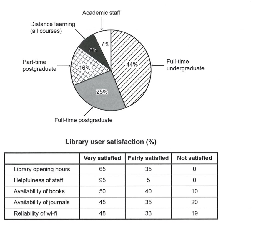
The pie chart and table give the results of a survey of library users at a university, showing who uses
the library and how satisfied different groups of users are with various aspects of it.
The pie chart reveals the make-up of the user base. By far the largest category is full-time
undergraduates, at 44% — nearly half of all users. Full-time postgraduates account for a further 25%,
and part-time postgraduates for 16%. The remaining groups are much smaller: distance-learning students
make up 8%, while academic staff form only 7% of library users. This indicates that the library is
overwhelmingly used by students, especially those studying full-time on campus.
The table shows satisfaction levels for five aspects of the library. Overall, users are very positive,
but some areas are valued more than others. Staff helpfulness receives the highest rating, with 95%
very satisfied and none dissatisfied. Library opening hours are also well received, at 65% very
satisfied and no one dissatisfied. The availability of books scores 50% very satisfied but 10% not
satisfied. Satisfaction falls further for journals (45% very, 20% not) and, most noticeably, for the
reliability of wi-fi, where only 48% are very satisfied and 19% are not satisfied.
In summary, the library is chiefly used by full-time undergraduates, and while users are broadly happy
with the service, the availability of journals and the reliability of wi-fi are the two weakest areas
and would benefit most from improvement.
Analysis
Task Response
Both the chart and the table are fully described and compared. The key points — the dominance of
undergraduates and the variation in satisfaction — are highlighted and connected, which is exactly what
the task asks for.
Takeaway: When given a chart + table, summarise each and then draw out the connection or the
weakest/strongest points.
Coherence & Cohesion
The pie and the table are given separate paragraphs, with a summary at the end that links the two.
Clear linkers ("By far the largest", "In summary", "further", "most noticeably").
Takeaway: Give each source its own paragraph, then a summary that compares across both.
Lexical Resource
Precise and varied: "the make-up of the user base", "account for", "make up", "very satisfied", "broadly
happy", "would benefit most from improvement". Register is academic and accurate.
Takeaway: Learn proportion verbs (account for, make up, comprise, constitute) and satisfaction
language.
Grammatical Range & Accuracy
Accurate present tense for survey results, with clear comparisons and relative clauses ("which is
exactly what the task asks for"). Error-free and controlled.
Takeaway: Use "with X and none Y" and "while Z are/were..." to handle data comparisons precisely.