Us Jobs Line
Line GraphQuestion
The graph below gives information about the number of jobs in four sectors of the economy in the US between 1960 and 2020.
Summarise the information by selecting and reporting the main features, and make comparisons where relevant.
Write at least 150 words.
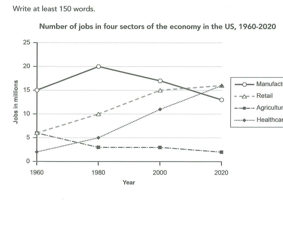
The line graph shows how the number of jobs in four sectors of the US economy changed between 1960 and 2020.
Overall, retail and healthcare expanded considerably over the period, while agriculture declined steadily and manufacturing, after an early peak, fell back so that retail overtook it as the largest employer.
In 1960, manufacturing employed the greatest number of people, at around 15 million. This rose to a peak of 20 million in 1980, then declined to roughly 16 million in 2000 and about 12.5 million by 2020. Retail, by contrast, grew continuously from 5 million in 1960 to 10 million in 1980 and 15 million in 2000, reaching just under 18 million at the end of the period, when it had become the dominant sector.
Healthcare started as the smallest sector, at about 3 million, and barely changed until 1980. It then expanded sharply, tripling to roughly 10 million by 2000 and reaching close to 13 million by 2020 — almost matching manufacturing. Agriculture, meanwhile, fell gradually from 5 million in 1960 to around 2.5 million by 2020, remaining the smallest sector throughout.
Analysis
Task Response
The overview compresses the whole story into one line: retail and healthcare expanded while agriculture contracted, and retail overtook manufacturing as the largest employer. Every key turning point is reported — manufacturing's 1980 peak, retail's uninterrupted climb, healthcare's post-1980 surge, agriculture's steady fall.
Takeaway: open a line-graph overview with the cross-sector shift (which line becomes dominant) rather than listing each line's start/end value. The reader needs the "who overtook whom" insight first.
Coherence & Cohesion
Paragraphs are grouped by direction of travel: overview, then manufacturing and retail (the two lines that swap dominance), then healthcare and agriculture (the rise-and-fall pair). This makes the comparison the backbone of the report rather than a mechanical "next, next" sequence.
Takeaway: pair lines that contrast within one body paragraph — a rising line against a falling line — so the comparison does the work of a connector.
Lexical Resource
Verbs are varied and precise: grew, rose, fell, declined, expanded, tripling, barely changed. "Dominant sector" and "the smallest sector throughout" give the ranking at each end of the period without reciting every number.
Takeaway: pre-build a change-verb set (rise/fall/climb/decline/peak/level off/multiply) and rotate through it — never reuse the same verb twice in a report.
Grammatical Range & Accuracy
Past-participle and present-participle phrases compress comparisons: "after an early peak, fell back", "almost matching manufacturing." The relative clause "when it had become the dominant sector" ties the endpoint to the overtaking moment cleanly.
Takeaway: use a participle phrase (matching X, peaking at Y, overtaking Z) instead of a full "which was..." clause to keep the sentence tight and signal Band 8 control.