Dance Classes
Task 1Question
The charts below give information on the location and types of dance classes young people in a town in
Australia are currently attending. Summarise the information by selecting and reporting the main
features, and make comparisons where relevant.
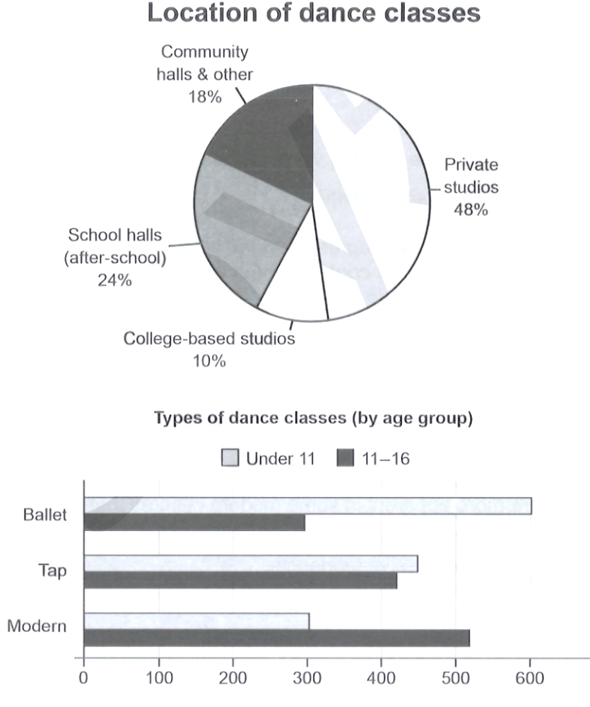
The two charts describe where young people in a town in Australia take dance classes and which types of
dance they attend, broken down by age group.
The pie chart shows the location of the classes. Private studios are by far the most common venue,
accounting for nearly half of all classes at 48%. School halls, used after school, are the second
largest with 24%, followed by community halls and other venues at 18%. College-based studios are the
least popular, at just 10%. This suggests that most young dancers attend dedicated professional
studios rather than schools or community centres.
The bar chart compares the numbers of students in the two age groups — under 11 and 11 to 16 — for
three types of dance. Ballet is the most popular class among the under-11s, with around 550 students,
but this number drops to roughly 300 for the 11-16 age group. Tap shows a fairly even split, with
approximately 430 under-11s and 420 eleven-to-sixteen-year-olds. Modern dance, by contrast, is far more
popular with the older group: about 280 under-11s attend compared with around 500 aged 11-16.
In summary, private studios dominate as the location for dance classes, and there is a clear shift in
preference with age — the very young favour ballet, while teenagers are more drawn to modern dance.
Analysis
Task Response
Both charts are fully described and connected. The location data is summarised and the age-based
differences are highlighted, with the key comparison (ballet for the young vs. modern for the older)
made explicit.
Takeaway: When a task has two charts, address each one and then draw out the relationship or
contrast between them.
Coherence & Cohesion
The two charts are given their own paragraphs, with a brief comment at the end of each and a summary
that ties them together. Clear linkers ("by far the most common", "by contrast", "In summary").
Takeaway: Give the pie and the bar each a paragraph, then a short summary that links both.
Lexical Resource
Precise and descriptive: "accounting for nearly half", "the least popular", "a fairly even split",
"far more popular", "drawn to". Numerical language is accurate and varied.
Takeaway: Learn a range of proportion verbs (account for, make up, comprise, represent) for pie
charts.
Grammatical Range & Accuracy
Accurate present tense for current data and clear comparisons ("which is roughly twice as many as...",
"compared with"). Complex sentences are handled without error.
Takeaway: Use "compared with" and "roughly twice as many" to make age-group comparisons precise.