Metals Price Change
Task 1Question
The graph below shows the average monthly change in the prices of three metals during 2014.
Summarise the information by selecting and reporting the main features, and make comparisons where
relevant.
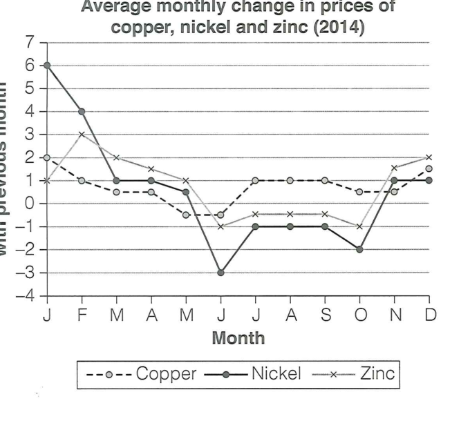
The line graph compares the average monthly percentage change in the prices of copper, nickel and
zinc over the course of 2014. Overall, nickel was by far the most volatile, while copper remained the
most stable, and zinc showed a mid-year peak that preceded a general fall.
Nickel experienced the most dramatic fluctuations. It began the year at its highest point, rising
by around 6% in January, before falling sharply to a fall of about 4% in February and continuing
downwards. It reached its lowest point in June, when prices fell by 3% compared with the previous
month. After that it recovered somewhat, staying around -1% to -2% through the second half of the
year before ending slightly positive in November and December.
Copper followed the steadiest path. It started at around +2% in January and then hovered between
roughly -1% and +1% for the rest of the year, never rising above about 1% and never falling below
-1%. It ended the year at approximately +1%, meaning it was the least affected by the volatility
that hit the other two metals.
Zinc was more variable. It rose from about +1% in January to a peak of roughly +3% in March — the
highest monthly increase apart from nickel's January figure — before falling below zero and
remaining between -1% and -0.5% for the middle part of the year. It then picked up again towards
the end of the year, rising to around +2% in November.
In summary, all three metals saw prices fall through the first half of 2014 and recover later in the
year, but nickel's swings were far sharper than copper's.
Analysis
Task Response
The graph is fully described, with each metal given its own clear treatment. The main trends — the
peak, the trough, and the relative stability of copper — are highlighted and compared, which is
exactly what the task asks for.
Takeaway: For a multi-line graph, give one metal per paragraph and end with a comparison — it
makes the report both complete and well organised.
Coherence & Cohesion
Paragraphs are organised by metal (nickel, copper, zinc), with a summary at the end. Clear linkers
("by far the most volatile", "followed the steadiest path", "was more variable") signal the structure.
Takeaway: Use a short adjective phrase as the topic sentence of each paragraph — it acts as a
mini-summary and guides the reader.
Lexical Resource
Precise numerical and trend vocabulary: "volatile", "fluctuations", "hovered between", "picked up",
"the highest... apart from". Language is accurate and idiomatic for data description.
Takeaway: Learn trend verbs and nouns (fluctuate, hover, peak, trough, pick up, recover) to
describe changes precisely.
Grammatical Range & Accuracy
Clear past-tense narration with complex subordinate clauses ("before falling sharply to...", "meaning
it was the least affected"). Comparisons and approximate language ("around", "roughly", "approximately")
are used accurately.
Takeaway: Use approximating adverbs (around, roughly, approximately) alongside precise numbers
to sound natural and honest.