Us Households Income
Task 1Question
The chart below shows the number of households in the US by their annual income in 2007, 2011 and 2015.
Summarise the information by selecting and reporting the main features, and make comparisons where relevant.
Write at least 150 words.
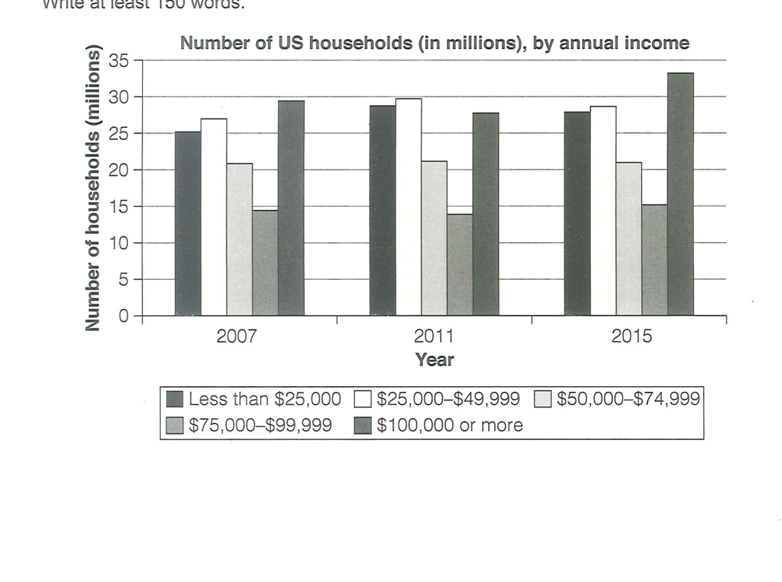
The bar chart shows how the number of US households in five income bands changed between 2007, 2011 and 2015, all measured in millions.
Overall, the highest-income group ($100,000 or more) was the largest and grew further over the period, while the two lower groups also increased. The smallest group, at 75,000–99,999, remained low, and the middle band was broadly stable.
In 2007, the $100,000-or-more group and the $25,000–49,999 band were the biggest, at 29 and 27 million respectively, while the $50,000–74,999 band accounted for 21 million, and the $75,000–99,999 group was the smallest at 14.5 million. The under-$25,000 group stood at 25 million.
By 2011, most bands had grown: the $25,000–49,999 group rose to a peak of 30 million, under-$25,000 reached 29 million, and the $50,000–74,999 band held at 21 million. The $75,000–99,999 group fell to its lowest at 14 million, while the top band dipped to 28 million.
By 2015, the highest-income group had expanded to 33 million, reclaiming its position as the clear leader. The $25,000–49,999 and under-$25,000 bands eased slightly to 28.5 and 28 million, the $50,000–74,999 group held steady at 21 million, and the $75,000–99,999 band recovered a little to 15.5 million.
Analysis
Task Response
The overview identifies the three most telling facts — the top group is largest and grows, the lower groups rise, and the $75–99k group stays smallest. It avoids the trap of reciting all fifteen figures by setting out the key comparisons first.
Takeaway: for a many-bar chart, lead the overview with which band dominates and how income shifted, not a run-through of every bar — pick the three highest-value comparisons and detail only those.
Coherence & Cohesion
The report groups by time (2007, then 2011, then 2015) rather than by band, which keeps the comparison within each year clean. Signals ("In 2007", "By 2011", "By 2015") frame each period.
Takeaway: for a grouped bar chart over three years, organise by year and report each band's movement within the year — this makes the temporal change the backbone of the description.
Lexical Resource
Numbers are reported with varied verbs and quantifiers: "accounted for", "edged up", "dipped slightly", "held steady", "recovering a little." "Reclaiming its position as the clear leader" gives a ranking verb to the shift.
Takeaway: build a set of small-movement verbs (edge up, dip, ease, hold steady, recover, reclaim) — a bar-chart that changes modestly still needs rich, precise language.
Grammatical Range & Accuracy
Participles and result phrases keep the figures flowing: "expanded to 32 million, reclaiming its position", "rose to a peak of 30 million", "recovering a little to 15.5 million." The comparative clause "the smallest group... remained low" anchors the ranking.
Takeaway: use present-participle clauses ("reclaiming", "recovering") after a figure to add a ranking or direction without starting a new sentence.