Shop Closures
Line GraphQuestion
The graph below shows the number of shops that closed and the number of new shops that opened in one country between 2011 and 2018.
Summarise the information by selecting and reporting the main features, and make comparisons where relevant.
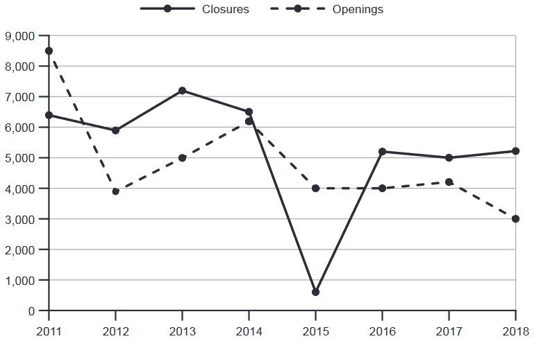
The line graph illustrates shop closures and new openings in a country between 2011 and 2018.
Overall, while both measures fluctuated considerably, the dominant pattern was a net decline in retail: openings fell substantially from their 2011 peak, whereas closures, despite a dramatic 2015 anomaly, ended only moderately below where they began.
In 2011, openings stood at 8,500, well above the 6,400 closures recorded. The gap reversed sharply in 2012 when openings plummeted to just under 4,000 — a drop of over half — while closures dipped only slightly to 5,900. Openings then partially recovered, rising to 6,200 by 2014 as closures fluctuated between 7,200 and 6,500.
2015 was anomalous: closures crashed to roughly 600 — the period's lowest — while openings held at 4,000, producing the only year after 2011 in which openings substantially exceeded closures. The anomaly was short-lived; closures rebounded to 5,200 in 2016 and stabilised around 5,000 through 2018. Openings, by contrast, showed no recovery: after a slight uptick to 4,200 in 2017, they fell to a period low of 3,000 in 2018, leaving closures 2,200 ahead — the joint-largest deficit of the period.
Analysis
Task Response
Data selection and coverage: The essay covers all key features of the graph — the 2011 peak for openings, the 2012 crash, the partial recovery of 2013–2014, the anomalous 2015 low for closures, and the terminal decline of openings to 3,000 in 2018. Nothing significant is omitted.
> "In 2011, openings stood at 8,500, well above the 6,400 closures recorded."
> "closures crashed to roughly 600 — the period's lowest"
> "they fell to a period low of 3,000 in 2018"
Beyond describing lines — calculating net difference: The essay repeatedly reports relationships between the two lines rather than merely describing each in isolation. The net-deficit calculation is not explicitly labelled on the chart; it is an analytical inference that demonstrates higher-order data interpretation.
> "leaving closures 2,200 ahead — the joint-largest deficit of the period"
Comparative ranking language: Data points are positioned relative to one another with precise qualifiers, not simply reported in isolation.
> "closures crashed to roughly 600 — the period's lowest"
> "the joint-largest deficit of the period"
Overview as independent paragraph: The overview is placed immediately after the paraphrase and captures the macro-story — volatility plus net decline — without getting drawn into specific years or figures. This satisfies the band 8+ requirement that the overview be clearly identifiable and separate.
> "while both measures fluctuated considerably, the dominant pattern was a net decline in retail"
Periodisation: The data is grouped into meaningful time blocks (2011–2014 vs. 2015–2018) rather than described year-by-year, which is the hallmark of analytical rather than mechanical reporting.
Reusable technique: When summarising a line graph with two related series, calculate the gap between them at key points and report it explicitly. Find the story — a peak, a crash, an anomaly, a terminal decline — and organise paragraphs around those narrative beats rather than chronology. Always place the overview as its own paragraph between the introduction and the first detail paragraph.
---
Coherence & Cohesion
Transition through evaluation, not chronology: Paragraph-to-paragraph movement is driven by analytical judgment ("anomalous," "short-lived"), not by year counters. This replaces mechanical "In 2011... In 2012..." sequencing with a narrative arc.
> "2015 was anomalous"
> "The anomaly was short-lived"
Short-sentence pivot: A semicolon creates a rhythmic break that signals a shift in focus, then the next clause resumes the data flow.
> "The anomaly was short-lived; closures rebounded to 5,200 in 2016..."
Contrast without formulaic connectors: Instead of "On the other hand" or "In contrast," the essay embeds contrast within the flow of the sentence.
> "Openings, by contrast, showed no recovery"
Time-span bridging: Rather than listing years individually, the essay uses phrases that group periods together, creating a sense of movement across time.
> "Openings then partially recovered, rising to 6,200 by 2014..."
Recurrence signal: A phrase that takes a specific observation and positions it within the broader data story.
> "producing the only year after 2011 in which openings substantially exceeded closures."
Reusable technique: Drive paragraph transitions with evaluation words (anomalous, recovery, reversal) rather than time words. Use a semicolon as a pivot — it creates breathing room and signals a narrative turn. When contrasting two lines, embed the contrast word ("by contrast," "conversely") inside the second clause rather than opening a new sentence with a transitional adverb.
---
Lexical Resource
Dramatic movement verbs: The essay deploys a wide range of precisely calibrated verbs for describing data movement, each carrying a different degree and speed.
> "openings plummeted to just under 4,000" — rapid, steep fall
> "partially recovered" — deliberate, incomplete rebound
> "closures crashed to roughly 600" — sudden, extreme drop
> "closures rebounded to 5,200" — rapid recovery after a low
> "after a slight uptick to 4,200" — small, incremental rise
> "they fell to a period low of 3,000" — decline with superlative positioning
Overview-level abstraction: High-frequency general nouns that summarise the character of the data before any specific figures are introduced.
> "fluctuated considerably"
> "a net decline in retail"
> "a dramatic 2015 anomaly"
Anomaly vocabulary: A specialised lexical set for isolating and characterising data points that break the pattern.
> "2015 was anomalous"
> "The anomaly was short-lived"
Precise comparison nouns: Rather than repeating "higher than" or "lower than," the essay uses nouns that convey the comparative relationship directly.
> "the joint-largest deficit of the period"
Stability language: Not all data moves — the essay also deploys vocabulary for flat or stable periods.
> "openings held at 4,000"
> "stabilised around 5,000"
Reusable technique: Build a personal lexicon of movement verbs organised by speed and magnitude (plummet/crash > plunge > fall sharply > decline > dip > uptick > stabilise). In the overview, deploy abstract summary nouns (volatility, trend, anomaly, deficit, recovery) before committing to any numbers. For the most important data point on the chart, reserve a distinctive phrase that no other point could use — "the joint-largest deficit" can only refer to one piece of data, and that precision signals lexical control.
---
Grammatical Range & Accuracy
Dash-appositive for in-sentence data interpretation: The em dash is used to embed an explanatory or amplifying phrase directly after a data statement, avoiding a separate sentence.
> "openings plummeted to just under 4,000 — a drop of over half — while closures dipped only slightly to 5,900"
> "closures crashed to roughly 600 — the period's lowest — while openings held at 4,000"
> "leaving closures 2,200 ahead — the joint-largest deficit of the period"
Participial clause for simultaneous action: A present-participle clause attaches a secondary action to the main clause, compressing two data movements into one sentence.
> "Openings then partially recovered, rising to 6,200 by 2014 as closures fluctuated between 7,200 and 6,500"
Relative clause with embedded data: A relative clause carries data inside it, keeping the sentence flowing without a full stop.
> "closures fluctuated between 7,200 and 6,500"
While-clause for simultaneous contrast: The subordinating conjunction "while" juxtaposes two opposing movements in a single complex sentence.
> "while openings held at 4,000, producing the only year after 2011 in which openings substantially exceeded closures"
> "after a slight uptick to 4,200 in 2017, they fell to a period low of 3,000 in 2018" — a participial phrase building to the main clause
Colon for enumeration within a sentence: The colon introduces an explanation or breakdown directly after an overview statement.
> "the dominant pattern was a net decline in retail: openings fell substantially from their 2011 peak, whereas closures..."
Reusable technique: The em-dash structure [data statement] — [amplification/interpretation] — [rest of sentence] is a high-band grammatical signature for Task 1. It allows you to report a figure and immediately contextualise it without breaking the sentence. Practice the pattern: "X stood at Y — the highest/lowest [figure/point] in the period — while Z [verb]ed..." The participial chain (-ing verb + data, main clause) is another reliable pattern for compressing multiple movements into one flowing sentence.